The Netflix interface has never been beautiful. It's not the point. The point is to get you to a movie as fast as possible, at which point "Netflix" disappears, and you're just looking at whatever you're watching.
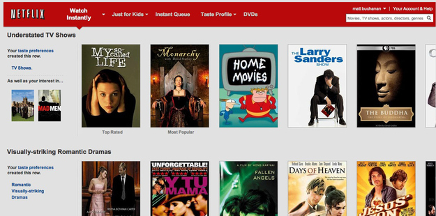
But the old, ugly Netflix has been slowly morphing into something that actually resembles a service from a modern internet company that's hired a designer or two. The page and the lines are cleaner. There's more space in the right places. The colors more uniform and subtle (and that gross beige is gone).
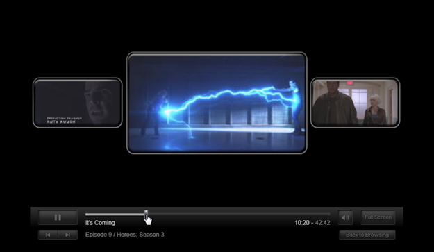
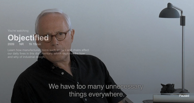
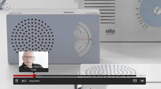
Now they've redesigned the video player too, into something that feels genuinely modern. There's less stuff and more detail. When you pause a movie, it fades out slightly, showing the title, summary and length. The clutter around the video progress bar is gone, leaving something sharper, richer and easier to use with better thumbnail previews and more precise navigation. And there are animations and transitions for just about every action.
The new video player's fantastic, and I suspect (hope) that whoever decided to start sweeping around the Netflix design department is just getting started. (via)