
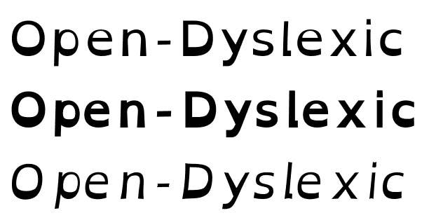
Many traditional fonts are too uniform for dyslexic readers — the letters share similar shapes and contours, which can result in something called "letter-swapping." Open-Dyslexic is one of a handful of fonts designed to cater to people with dyslexia, and among the first to make inroads into the app world.
Its lumpy, bottom-heavy letter shapes might seem strange, or almost cartoonish. But this style of typography has been proven to reduce reading errors for dyslexics. This video explains how Dyslexie, a similar font, works:


Open-Dyslexic is free and used by a small number of apps and websites, but recently got a high-profile public endorsement by Marco Arment, who included it in the latest version of the popular Instapaper app. Here's what it looks like:
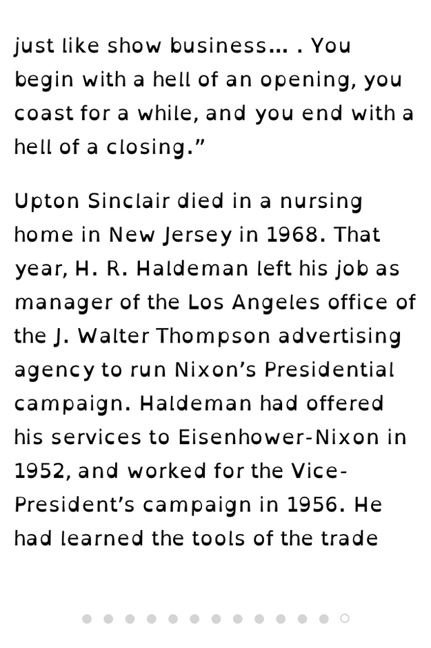
The move to Instapaper is a particularly powerful one. The app lets you save virtually any web text to be read later, simplifies its formatting and removes ads. It also replaces the font — something which, before, just made long stories a little bit easier on the eyes. Now, it might make them legible.