
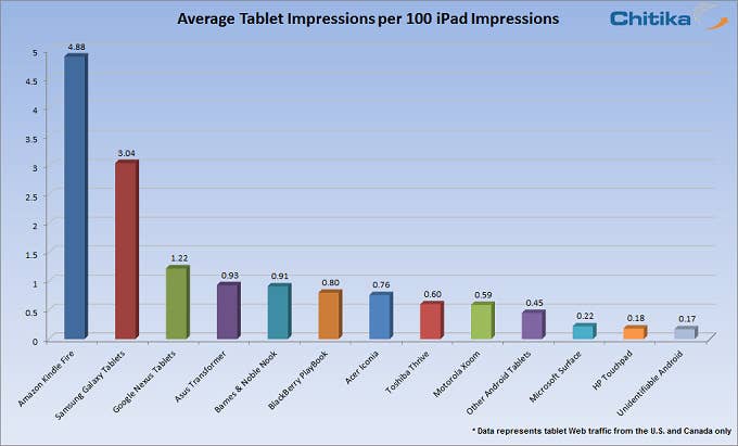
Analytics firm Chitika published some surprising data this week: For every 100 visits from iPad users, the sites it tracks received just five from Kindle Fire users, three from Galaxy Tab users, and 0.2 from Microsoft Surface users.
That's a pretty stark difference. But the chart they used to illustrate it, above, seemed a little off. The Y axis ends at five! But the title suggests a Y axis of 100.
So just what would a hundred-to-five comparison look like here?
This is what the chart looks like if you include the iPad:
The data isn't a perfect representation of sales, but it's a pretty good representation of where the tablet market is right now. Android is winning the smartphone market, in terms of units sold. But in tablets, it's barely made a mark.