This post has not been vetted or endorsed by BuzzFeed's editorial staff. BuzzFeed Community is a place where anyone can create a post or quiz. Try making your own!
Hooters updates its logo, girls still look hot
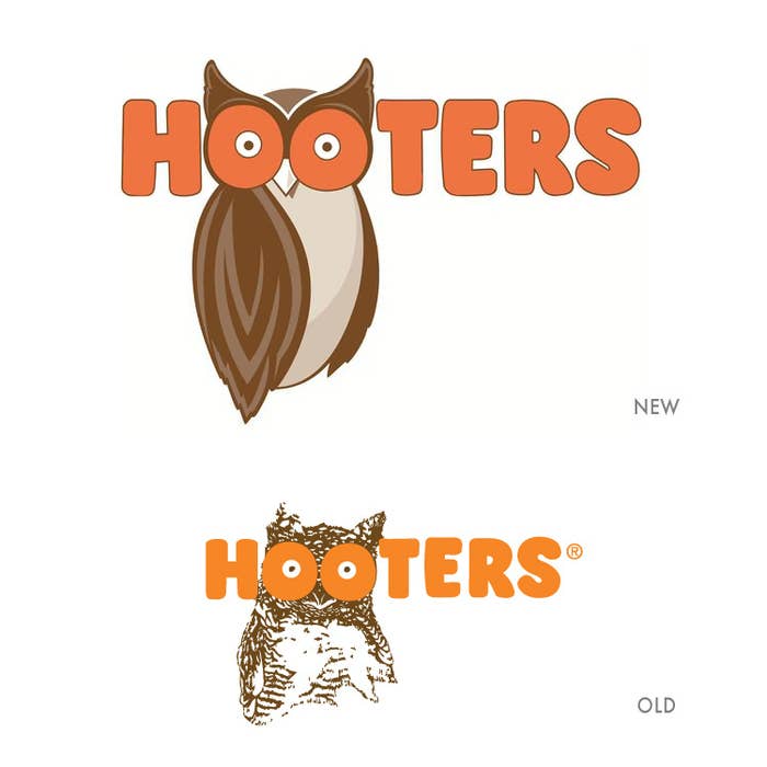
Hooters started rolling out their new leaner and more focused owl to replace their iconic decades old rustic bird. The iconic boob eyes are still there just as the orange-brown color combo. The girls are still hot so as their 911 buffalo wings and that's all it matters. Check out the various new, old and thematic implementations of the logo below.
"We wanted to give 'Hootie' a facelift along with the stores," says Henninger, chief marketing officer of Hooters. Three decades ago, when the fledgling Hooters had no logo, the company traced the owl's image from the pages of a dictionary, he says.
According to USA Today executives aren't making this change lightly. Hooters did online research with 300 consumers to comment on a handful of different owl designs created by the Atlanta design firm Sky Design. In consumer polling, the new design was preferred roughly 9 to 1 over the old design.

