
Source: cdn.last.fm
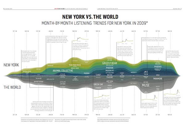
Here is a chart to make you feel superior* or to make you hate hipsters even more, depending on where you live.
And call me a music snob, but as a New Yorker, the bands on this chart are pretty much all embarrassing. Then again, I could only think of one album to put in my top-ten-albums-of-2009 list, so maybe it was just a bad year…
Call me a chart snob, but as pretty as it is, this could have been graphed in a way that allows for better following of the peaking trends. Seriously. This graph maker needs to think about what the graph is supposed to show. (And not pick such close colors!)
Special Reactions
Your Reaction?
React with an animated GIF!
READY. SET. REACT!
GET STARTED